Designing the Sweet Harmony flyer
Designing the Sweet Harmony flyer
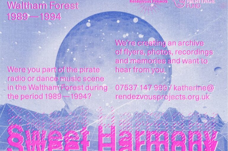
We worked with Claudia Schenk from Trockenbrot to design the flyers for Sweet Harmony. The brief was to design a flyer that was influenced by the graphic design of the 1980s and 1990s rave flyers.
We’ve all become so entrenched in designing with computers, that this was easier said than done. Claudia was extremely patient with us as we fed back on earlier designs that we wanted something ‘rougher’ and more ‘lo-fi’ and the resulting series of limited edition, Riso printed flyers, are beautiful.
In the ’80s and ’90s there were two kinds of flyers being produced, the low-tech hand-made flyers that the smaller promoters would produce and the more hi-tech futuristic-looking graphics, with lots fonts and colours, produced for the larger clubs and events. As one of the themes of our project is the do-it-yourself attitude of local people and activities in Waltham Forest at the time, we were definitely picturing something that reflected that lo-fi sensibility.
We spoke to Claudia about her design process:
[su_slider source=”media: 261,260,259,258,257,256,255,254,253″ height=”480″ title=”no” pages=”no” mousewheel=”no”]
When I started designing these on the computer everything I came up with was way to slick, too designed and too modern looking. It is impossible to do wonky lettering and grainy images on a computer.
Short of cutting things out and sticking them on paper I thought about what other processes would have been used and RISO printing came to my mind.
It derives from the 1980s and is basically a photocopier using proper ink not pigment like a laser copier. Different colours have to be printed consecutively, which means proper alignment is nigh impossible. This is exactly what I wanted. The challenge really was to relay to Katherine how the printed flyer would look, as that is something that cannot be simulated on the computer. Katherine had to trust me on this. Experience with Riso printing gives you an idea of what an image will print like. On the day of printing I had to adjust the contrast as the Riso printers do not like too many dark areas, it clogs up the machine!
The best thing about Riso is that you can use fluorescent inks, which look amazing.
Riso printing is really hands-on, so I was able to print different colour variations from the same design, to make sure I ended up with one that we would all love. The graininess, the mismatched register, the lo-fi graphics all contributed to re-creating the feel of the rave flyers of the ’80s and ’90s without being a simple facsimile.
Without having had a background in printmaking I don’t think I would have been able to do so with a just a computer.